Websites are a critical part of any business, but especially for home builders. Buying a home is a massive undertaking, and with so many potential customers beginning their initial home search online, they should be able to visit home builder websites and easily learn everything they need to know.
10 Tips for Home Builder Websites

1. Get to the Point
Answer the question: What do you build and where do you build it? One of the quickest ways to lose the interest of a potential customer is to make it complicated for them to determine if you build what they are looking for, such as townhomes, single-family homes or custom homes, if you do remodels or additions and if you build that product in or serve their preferred area.
2. Search + Filter Tools
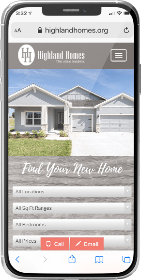
Searching for a new home should be as easy as shopping online anywhere else. To help narrow choices quickly, advanced search and filter tools should include options to filter by location including city or school district, community, home type, elevation style, number of bedrooms, square footage and more.

3. Location, Location, Location.
Possibly one of the most important aspects of the homebuying process, a functional map is crucial for any home builder website. Potential buyers want to know exactly what to expect as it pertains to distance from major roadways, everyday conveniences, recreational destinations, schools and more. While explaining a community or home’s location through descriptive text is helpful, pinpointing on a map offers a more accurate visual representation.
4. Transparency is Key
Make it a point to provide content that educates potential homebuyers on the buying process. Not only does quality content improve Google rankings, but it also makes it clear to the buyer that your company follows specific steps to provide as seamless of a process as possible – which is always the goal.
Also consider including buyer testimonials on the website. A positive review speaks volumes to potential customers.
5. Tools that Emotionally Engage with Buyers
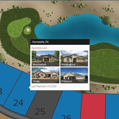
A multi-media approach offers more ways for visitors to connect with your work. This includes professional photography, videos, interactive floor plans to explore design options, interactive site maps to pick the perfect homesite and virtual tours to easily navigate through model or move-in ready homes. Also offer access to Online Sales Counselors (OSC) to answer questions visitors might have in real-time – making them more likely to move forward with buying or joining a VIP List in exchange for direct contact information.


6. Accurate, Up-to-Date Inventory + Pricing
You’ve gone through the website and found the perfect home, so you contact the respective person only to find out that home is no longer available. The homebuying industry continues to move quickly, and a home builder’s website should do the same with the latest home availability and accurate pricing. An inaccurate website can easily deter a possible customer as an indication of a lack of general communication throughout the buying process.
7. Optimized for Mobile
From smartphones to tablets, all websites should be optimized for mobile use. According to Statista, mobile devices (excluding tablets) generated 54.8% of global website traffic in the first quarter of 2021, consistently hovering around the 50% mark since the beginning of 2017. Make sure content displayed on mobile is usable and add mobile-only navigation features like static footers and accordions.
8. Clear Call-to-Action
The call-to-action (CTA) is a major component of a webpage, acting as a marker telling visitors what to do next. Be sure to include prominent and clear CTAs in both headers and footers and across all pages. Use strong, direct words to prompt action: Schedule a Tour, Reserve Now, Join VIP List.

9. Buy Now Button
Getting home buyers to take the next step toward purchasing a home should be as easy as clicking a “Buy Now” button. A popular topic within the homebuilding industry, Buy Now buttons can allow qualified buyers to reserve a specific homesite, submit a mortgage application or upload necessary paperwork to a builder for approval. Learn more about implementing a Buy Now strategy on home builder websites on our podcast, or contact us.
10. Prominent Lead Capture
No surprise, most users protect their contact information and only share it if truly interested in learning more. An effective lead capture element should only request the most essential information, such as name, phone and email. Additionally, consider placing the lead capture form above the website fold – meaning it is visible the minute the website loads, no scrolling necessary or as a static footer on mobile view.

11. Bonus Tip
Hire a professional, like Blue Tangerine! Not all home builder websites are created equal, and the Blue Tangerine team has the experience to build a website that resonates with potential homebuyers as they begin their new home search. Learn more about home builder marketing services from Blue Tangerine.